Art
Art for Advertising: Erich Strenger – When Winning Is Beautiful
From the 356 to the 917, Erich Strenger turned Porsche’s race victories into posters that outlasted the results themselves.
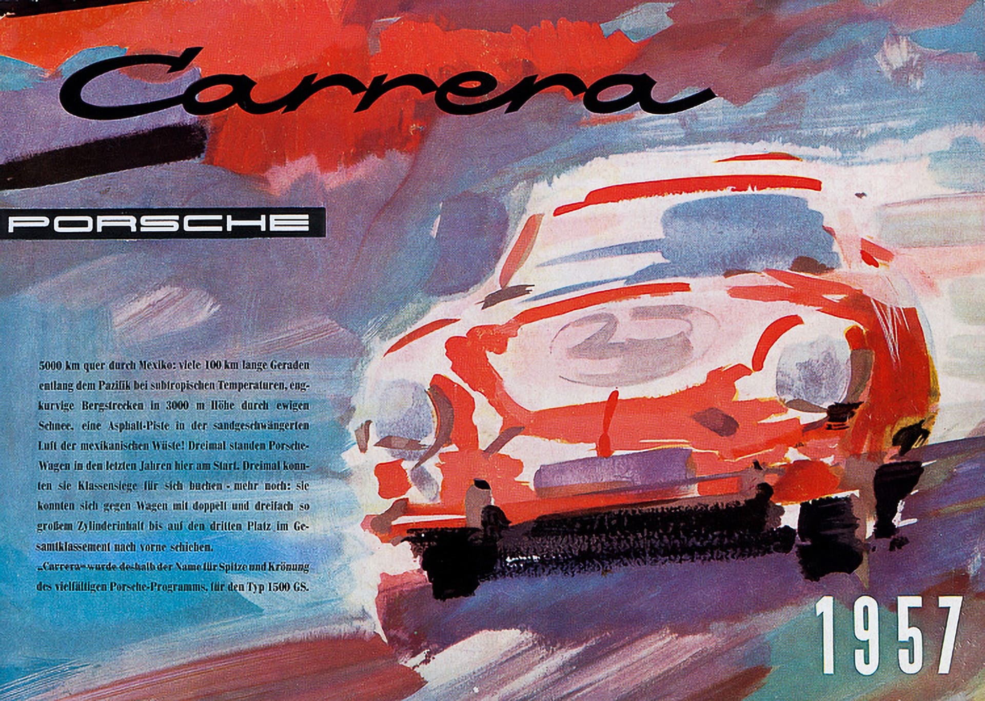
To win on a Sunday and tell the story by Monday: that was the challenge Erich Strenger faced for more than thirty years, turning Porsche’s sporting successes into posters and advertisements destined to become small works of art. Time was desperately short – often the composition had to be prepared before the race had even finished, with only the winners’ names and the photograph of the car added at the last moment. Today, in the digital age, that seems like nothing; back then, everything was far more complex and slow. A chance encounter with Richard von Frankenberg – racing driver, journalist, and a figure central to Porsche’s communications – gave rise to an immediate mutual regard: both passionate about the little 356, they found a common language at once, and that same year Huschke von Hanstein, the head of racing, began entrusting him with the victory posters. A dream that Erich marked by buying a 356. Curiously, in the Italian colour. Red.
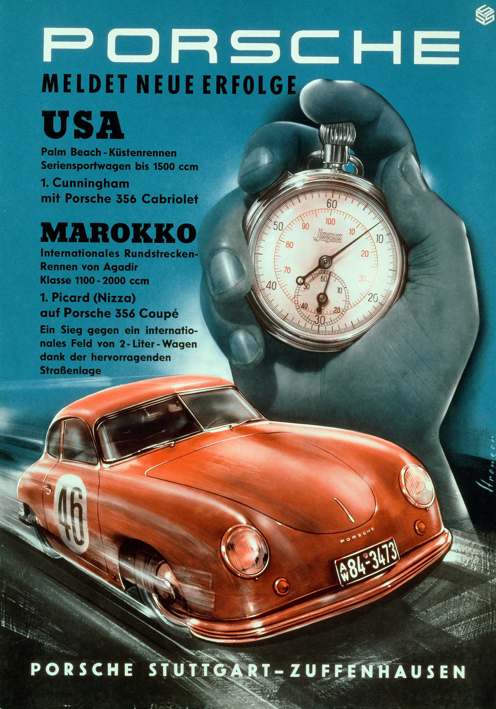
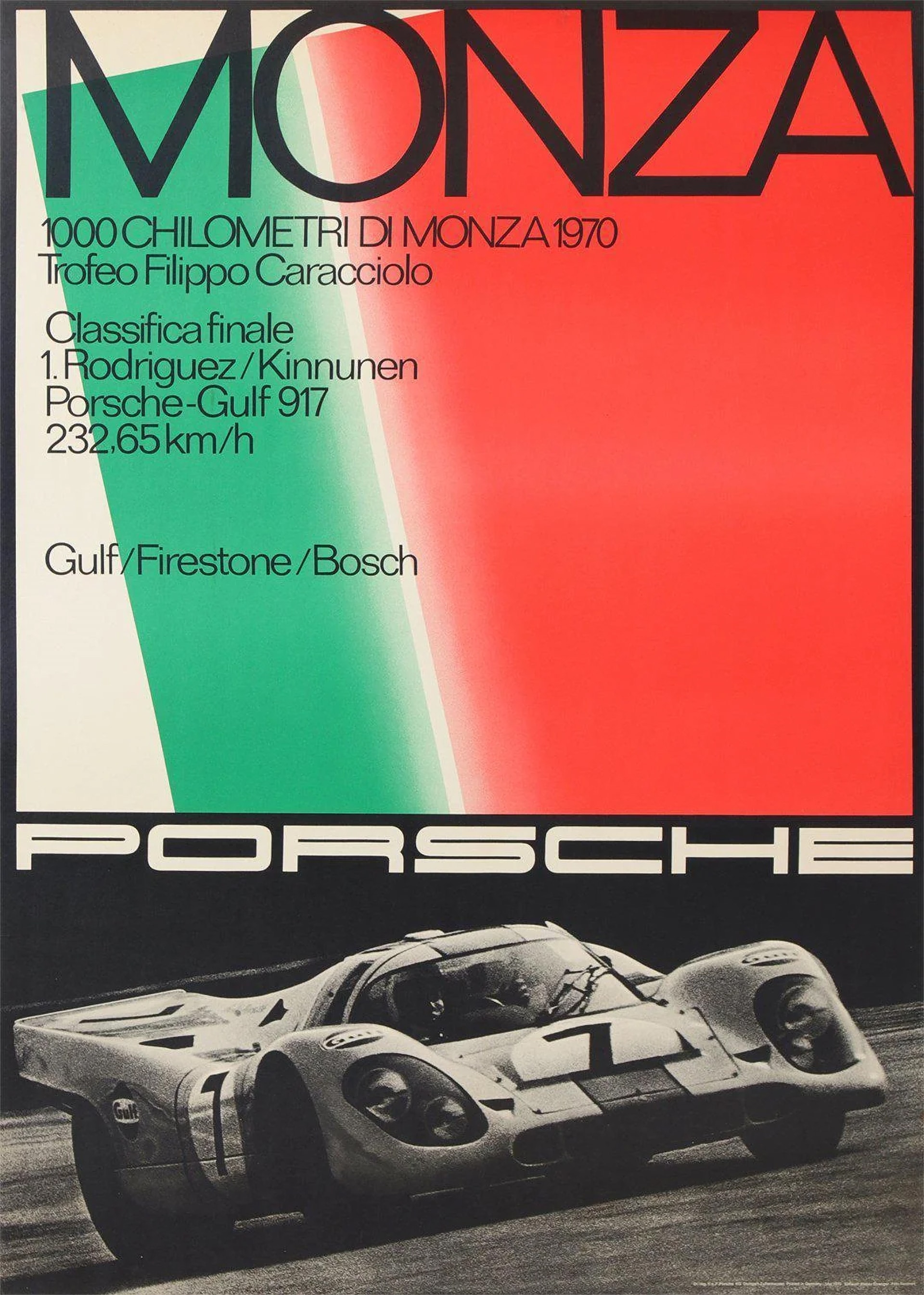
In the early years his style was close to painting and illustration. In the poster dedicated to victories in the United States and Morocco, speed is rendered through a red 356 – as it happens – and an oversized chronometer. In the Carrera Panamericana of 1953, by contrast, a pre-Columbian sculpture dominates the scene, transforming a motor racing victory into something almost cinematic. Each race became an opportunity to experiment with a different solution. As the years passed, Strenger began to work with photographs, bold colours, and ever larger letterforms. Already in the Targa Florio poster of 1959, near-abstract geometric forms held sway over the cars themselves. But it was with the great victories of the Porsche 917 that this language found some of its most compelling expressions. At Monza in April 1970, the Porsche 917 Gulf of Rodríguez and Kinnunen defeated the Ferrari 512 S in one of the defining duels of the World Sportscar Championship. Strenger did not depict the battle on track: instead he chose the Italian colours and monumental typography, turning the sporting result into an image of instant recognition.
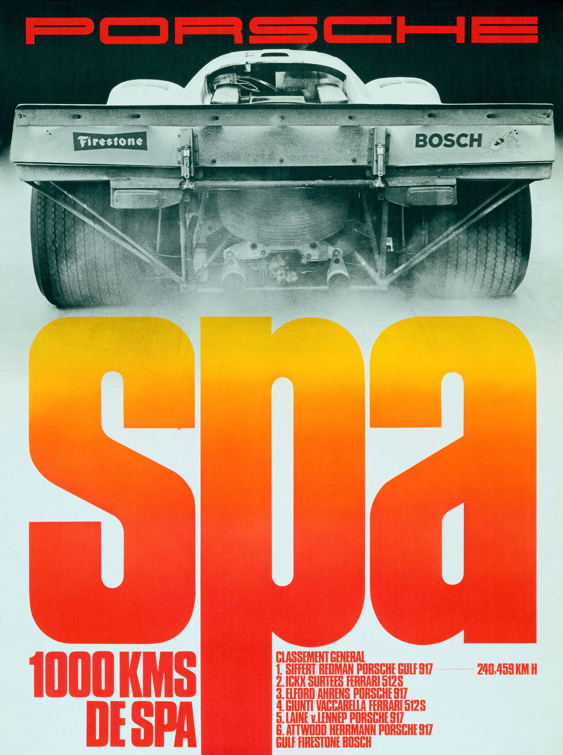
A few weeks later, at Spa-Francorchamps, another victory for the 917 arrived – this time with Siffert and Redman. The photograph Strenger chose shows the car from behind, almost as a reminder of the view their rivals had of it, while the word SPA fills most of the poster. Speed is no longer drawn: it is the photographic image and the force of the lettering that suggest it.
In 1973, Mark Donohue’s Porsche 917/30 carried this graphic evolution still further. At Road America the American Can-Am series was the domain of cars of formidable power, and Strenger responded with a poster built from diagonals, colours, and contrasts. It was no longer necessary to paint a car in motion: a handful of elements was enough to convey all its energy.
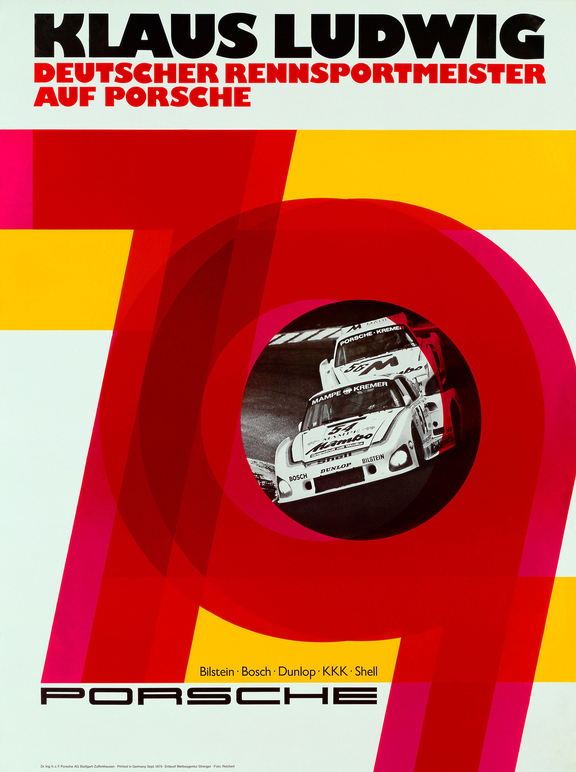
The poster dedicated to Klaus Ludwig in 1979 represents perhaps the furthest point of this search. The Porsche 935 cars of the Kremer team are enclosed within a circle, surrounded by large overlapping forms. It is an image that could belong to a contemporary graphic design exhibition as readily as to Porsche’s sporting communications. Strenger also contributed to the definition of the Porsche wordmark and, together with von Frankenberg, to the founding of Christophorus, the marque’s customer magazine. Retiring in 1988, he moved to Majorca, where he continued to paint, devoting himself to abstract art and Op Art – having accompanied Porsche from the 356 through the great sports cars and the Turbo models, always adapting his hand to the technical advances of the machine.